Note: Blogger is a bit weird about how it handles large images. Click a picture to get a larger image, then right click and choose 'View Image' to see it at its full resolution.

Contents
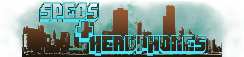
I quickly found that the best way to have interesting headers was to make them in Photoshop and import them as images. That, coupled with the dotted divider lines keeps the page clean.
I quickly found that the best way to have interesting headers was to make them in Photoshop and import them as images. That, coupled with the dotted divider lines keeps the page clean.

Entertainment
The layout guides for this issue didn't accommodate for the headers and footers of each page, so some pages are rather... close. I'm quite pleased with how the 'Lemon Press Recommends' graphic turned out.
The layout guides for this issue didn't accommodate for the headers and footers of each page, so some pages are rather... close. I'm quite pleased with how the 'Lemon Press Recommends' graphic turned out.

Opinion
It's a small thing, but this page turned out solidly, the Headline fonts especially.
It's a small thing, but this page turned out solidly, the Headline fonts especially.


Sports Pages 1 & 2
The Formula One News banner turned out great! It's a shame I didn't have cause to use it again in future issues.
The Formula One News banner turned out great! It's a shame I didn't have cause to use it again in future issues.
No comments:
Post a Comment